By studying the logo of the educational institution located in Aligarh, India (founded as the Madarsatul Uloom Musalmanan-i Hind in 1875, it became the Muhammadan Anglo-Oriental College in 1877, and subsequently, the Aligarh Muslim University in 1920), I propose to shed light on the existence of the university in its colonial and postcolonial moments. This self-positioning is emblematic of the values the institution wishes to centre, because the logo is itself an emblem. Its performative uses on letterheads, degrees, and buildings reflect the centrality of this visual signature. The changing face of the logo can be read as reflecting the realities of its time.
1. Logo of the Madarsatul Uloom Musalmanan-i Hind
This first logo is from the infancy of the institution. Owing to financial difficulties of the time, it is an unpretentious and unassuming emblem, carved on a plaque commemorating a donation to the Madarsatul Uloom. The use of only Persian in the logo, shaped as a dome of a mosque, reflects a solely Muslim identity of the fledgling institution.
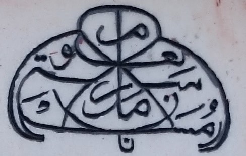
Following the foundation laying ceremony by the Viceroy Lord Lytton, the old logo was superseded by a much more ornamental one produced on opulent marble. This was installed on the main gate as well as the central hall of the College.
2. Logo of the Muhammadan Anglo-Oriental College
This logo was in use from 8 January 1877 to 17 December 1920. It was introduced on 8 January 1877 when the foundation of the College was laid.
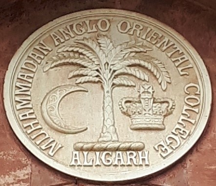
The logo is significant on many counts. It records only in English the name of the institution, the Muhammadan Anglo-Oriental College, itself brimming with possibilities: the primacy of the community which created the college, the hyphenation of ‘Anglo’ and ‘Oriental’ – terms otherwise considered incongruent if not entirely antithetical. The optics of the logo, with “the hallowed crescent on one side, and the Crown of Her Majesty, under the date-palm signifying the Prophet’s land” (Alam, 2013, p. 84) are significant, equating as it does the Islamic symbol of the crescent and the British crown, all the while under the benevolent shade of the Hijaz where Islam was revealed. This presents once more the primacy of the Islamic identity over the secular-worldly ones. Noteworthy here is the removal of the Perso-Urdu script in its entirety, a signal change in linguistic identification.
This was perhaps a calculated move, signalling the hybrid culture to be adhered to at Aligarh – the intermixing of Muslim identity and British hegemony. The creation of a Muslim service elite which could navigate the colonial order is symbolic of the Aligarh project, as explored by Lelyveld (2003, p. 18).
3. Logo of the Aligarh Muslim University (1920)
The new logo of the Aligarh Muslim University, introduced in December 1920. It almost replicates the old College logo.
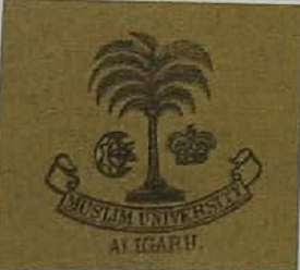
The name of the new university was a matter of great discord between the proponents of the university, the Indian colonial government, and the British government in London (Minault & Lelyveld, 2020, p. 162). The initial demand was for the “Muslim University” at Aligarh, whereas the British government wanted it to be called the “University of Aligarh”. A compromise was reached at the “Aligarh Muslim University”, the name still in use. However, in the early years of existence of the university, it continued to be known as the Muslim University, with ‘Aligarh’ seeming like an afterthought, asserting again the prominence of the community which created and fostered the institution.
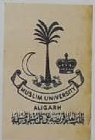
4. Logo of the Aligarh Muslim University (c. 1930)
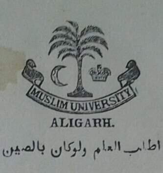
This logo was one of the many used between 1920-1947. This carries an Arabic saying, misattributed to the Prophet Muhammad, enjoining the quest for knowledge even if it be in China.
The relevance of this saying, erroneously considered a hadith (saying of the Prophet Muhammad), for an educational institution of Muslims is obvious.
5. Logo of the Aligarh Muslim University (c. 1938)
This logo was one of the many used between 1920-1947. This carries a Hadith, stating that the attainment of knowledge is obligatory upon all Muslim men and women.
6. Logo of the Aligarh Muslim University (c. 1947-1949)

Photo of the Aligarh Muslim University logo after Independence. [Photograph: 2017]. This logo was one of the placeholders following Indian independence in 1947. The British Crown has been replaced by a five-pointed star.
The time around the Independence and Partition of India and Pakistan in 1947 was a tumultuous time for the Muslim University, which had, in Jinnah’s words, been the “arsenal of Muslim India” (Dhulipala, 2015, p. 391) and the intellectual epicentre for the demand for Pakistan. The crescent and the five-pointed star, previously seen on the Muslim League logo, was present on the Pakistani flag too. In the Aligarh context, it supplanted the Crown, insisting upon the Muslim identity of the institution even as it increasingly came under threat. However, this proved to be a temporary measure.
7. Logo of the Aligarh Muslim University (c. 1955-date)
This is the existing logo of the Aligarh Muslim University. Among its many noteworthy features are the inclusion of a verse from the Quran, used as the motto of the University, the inclusion of the name of the University in Urdu, the circuitous and current English form of the name of the University, and the open book instead of the erstwhile Crown (and temporarily the five-pointed star).
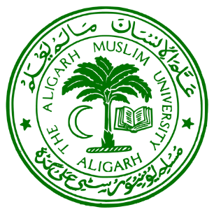
This logo is the one currently in use at the Aligarh Muslim University, and has many significant features. Primary among them is the Quranic verse as the University motto, (“Taught man what he knew not.” Quran 96:5) underscoring the Muslim ethos of the institution. The name of the University in English is “The Aligarh Muslim University, Aligarh”. This was changed on a government mandate, possibly to situate it firmly within the borders of the newly-independent India. Interestingly enough, the Urdu text reads: “Muslim University, Aligarh”, the older name of the institution.
After Independence, Urdu became the national language of Pakistan and was viewed with mistrust in India. The Urdu present in the logo may be understood as an exercise in rehabilitation of the language associated with North Indian Muslim culture.
The divergent Urdu text may be said to be indicating towards a more Muslim bent, of refusing to relinquish a marker of identity. This is a two-fold process:
- The name – Muslim University, Aligarh – privileges the association of Muslimness
- The script and language are marker of modern Indian Muslim identity, and in Geertz’s formulation, is a ‘wink’ for those in that linguistic community (which overlaps with the Muslim community).
In this light, the composition of the logo, through the ages, must necessarily be understood as a deliberate statement of the self-formulation of the community and its institution in changing times.